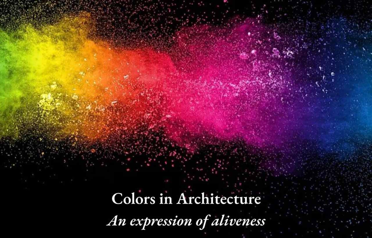
Colors in Architecture: An Expression of Aliveness
- January 20, 2023
- By: Editorial Team
- INFLUENCERS
We sense our world through myriad expressions of forms, colours, and patterns understanding our intentions and emotions. The colours and textures add drama to our perceptions. The beauty of shades, shadows, and tones indicates the WOW factor that drives us.
The manifestation of our imaginations, fantasies, ideas, and concepts are found in various shapes throughout our history, and thus colours are widely used to represent the boldness and simplicity of our thinking. Colour psychology is the study of how hues and tones affect human emotions, moods, and behaviour. To create various architectural illustrations that are responsive to people's needs and desires, designers must comprehend the insights of colour psychology in depth.
When it comes to architecture, have you ever thought why colour is so important?
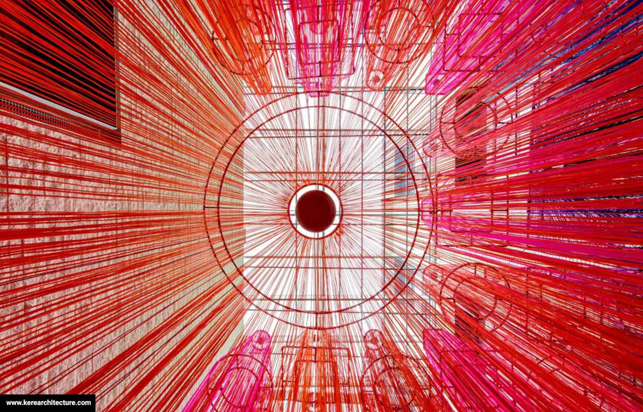
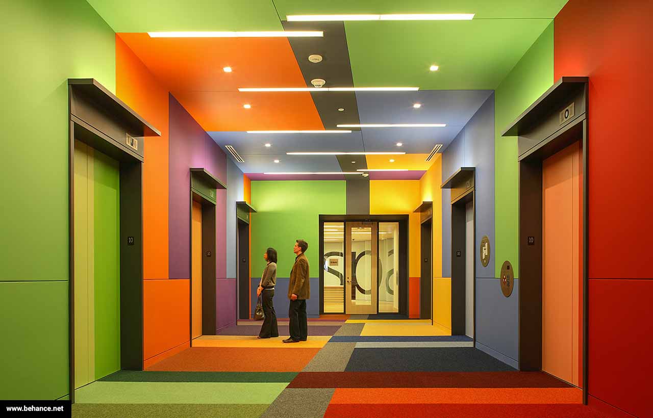 Valspar Corporate Headquarters
Colours portray an impression on the users in the shape of reflection, texture, light, material, sense of belonging, and memories. One of the characteristics of our distorted perceptions is the creation of an illusionary reality based on different meanings, patterns, and forms. As such, it is evident that colours have a connection to architecture, and it is imperative to explore their relationship.
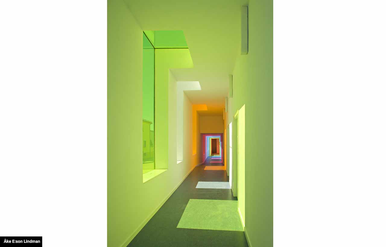
We get different visual effects when we apply certain colours on the different surfaces of an environment with walls, floors, and ceilings. For example, the application of dark shades on a ceiling creates the impression of a more inferior space; the application of colour on the prominent wall of space creates a visual illusion of spatial shortening, whereas the application of it to all walls creates the impression of a longer space than it really is.
Adding colour to only the side walls of the space can cause a sense of narrowing; otherwise, adding colour to the central wall and ceiling will increase the feeling of space. A painted space with all surfaces lowered to half height, and the darker tones on the upper surfaces create this desired effect. This lowers the height of the space and puts the focus on the eye level of the observer.
To understand the "psychology" of the main colors, the following ideas have been developed
- The colour BLUE conveys a feeling of confidence, positivity, and security. Banking agencies, offices, and companies are frequently using it in commercial and business spaces.
- An optimistic, curious, and jovial atmosphere is portrayed by the colour YELLOW. To attract pedestrians' attention, it is often used in restaurants or commercial spaces.
- An energetic, exciting, and impulse-driven color is RED. Since it portrays compulsivity and a desire to consume, it’s commonly used in commercial spaces like stores and fast-food restaurants.
- The VIOLET colour radiates a sense of calm, comfort, and softness.
- GREEN Symbolises well-being, calm, serenity, and tranquility. In hospitals and relaxation centers, it is often used to boost health and well-being.
- Intense, creative, euphoric, and enthusiastic, ORANGE conveys passion, intensity, and creative expression. There are many creative environments in which it is used, such as offices, studios, and schools. When combined with blue, it conveys an impression of trust and impulsivity and is thus adopted by banks.
The experiences associated with colour can be symbolic, associative, synesthetic, or emotional since the colour is a sensory perception. Science has proven this to be true through colour ergonomics systems, which integrate the body, mind, psychosomatic effects, visual ergonomics, and colour's psychological effects into one system. Designers must understand how the body receives visual stimulation, processes it, and evokes responses to facilitate human well-being.
Understanding some of the concepts of colour science and vision is essential for understanding the complex relationship between humans and colour. Seeing colour depends on three presuppositions, one of which is the presence of light, the other being the ability of the eye to perceive color, and the third being the ability of the brain to process the colour stimulus.
Throughout our psycho-spatial relationship, colours and their perceptions are responsible for conscious and subconscious inspirations. There is no place where it cannot be found--no matter what its variations may be. Colour is a vital component of architectural objects that affects not only the construction but also what a user experiences when s/he looks at it.
In Israel Pedrosa's view, "a coloured sensation is the result of light nuances being reflected or refracted by a material; the word colour serves as a description of various shades of light that produce a chromatic sensation."