Mercury Architects: Discovering How Colours Tell a Story
- April 19, 2024
- By: Editorial Team
- INFLUENCERS
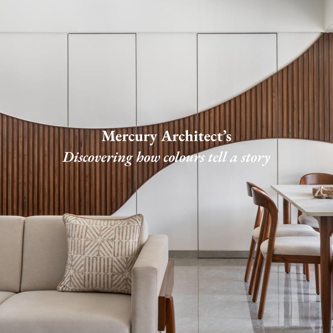
We often find particular colour pairings soothing or energising, while some colour combinations just make our heads hurt. With the help of Mercury Architects, BMR presents an in-depth feature about colours and their effect through an innovative bespoke interior project.
Imagine a room with a colour pairing of just Neon Cyan and Neon Pink. To us, that just seems like an interior designer's nightmare. But the intriguing thing is that the problem does not lie in the colours themselves. Neon Cyan and Neon Pink can be used in moderation as accent colours to evoke the CyberPunk aesthetic that gaming enthusiasts are often fond of.
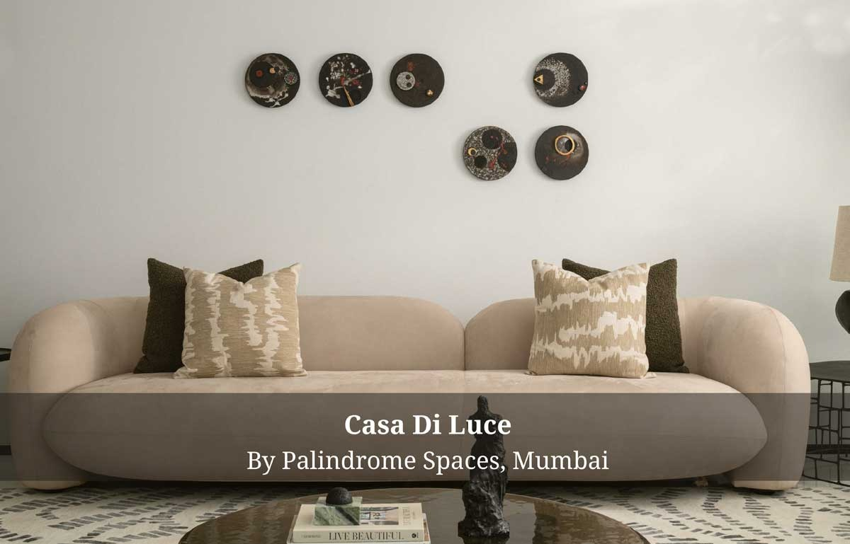
.jpg) Appropriate use of colour not only makes things and spaces look visually appealing but also holds the potential to invoke certain emotions. Our brains are wired to associate certain colours with feelings based on our life experiences. It may be natural, like that of the brown and green which evoke the calmness we associate with nature, which is a universal experience. It may also be the reinforcement of a deliberate branding strategy since many brands have used specific colours in their marketing for decades. The use of this understanding reinforces their values through the consistent use of brand colours, which makes us associate certain colours with certain feelings.
Appropriate use of colour not only makes things and spaces look visually appealing but also holds the potential to invoke certain emotions. Our brains are wired to associate certain colours with feelings based on our life experiences. It may be natural, like that of the brown and green which evoke the calmness we associate with nature, which is a universal experience. It may also be the reinforcement of a deliberate branding strategy since many brands have used specific colours in their marketing for decades. The use of this understanding reinforces their values through the consistent use of brand colours, which makes us associate certain colours with certain feelings.
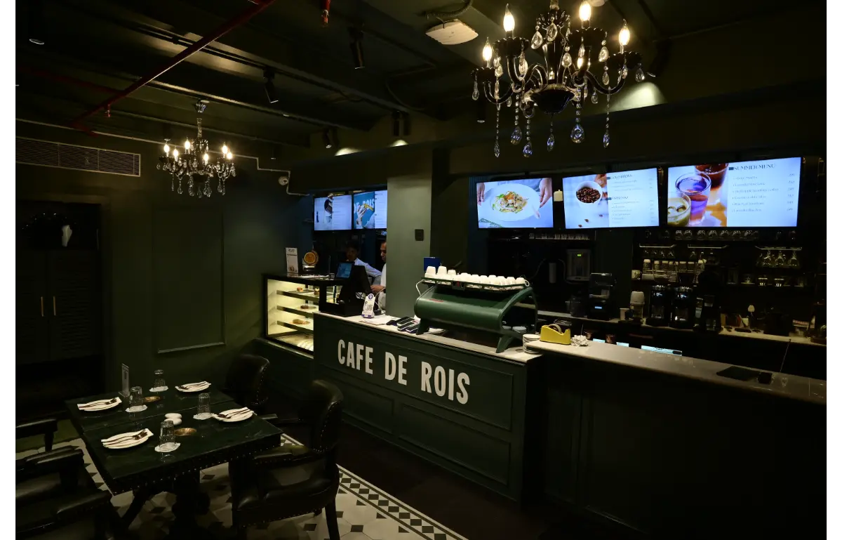
.jpg) Often considered an afterthought, colour in interior design is seldom considered a pragmatic choice, but rather a whim. Colour only plays a significant role in enhancing the greater scheme of design if it is considered an integral part of the process. Specifically talking about the Indian subcontinent, with the importance of Vastu in our culture, it becomes an additional factor alongside natural lighting, spatial volumes and branding when it comes to commercial spaces.
Often considered an afterthought, colour in interior design is seldom considered a pragmatic choice, but rather a whim. Colour only plays a significant role in enhancing the greater scheme of design if it is considered an integral part of the process. Specifically talking about the Indian subcontinent, with the importance of Vastu in our culture, it becomes an additional factor alongside natural lighting, spatial volumes and branding when it comes to commercial spaces.
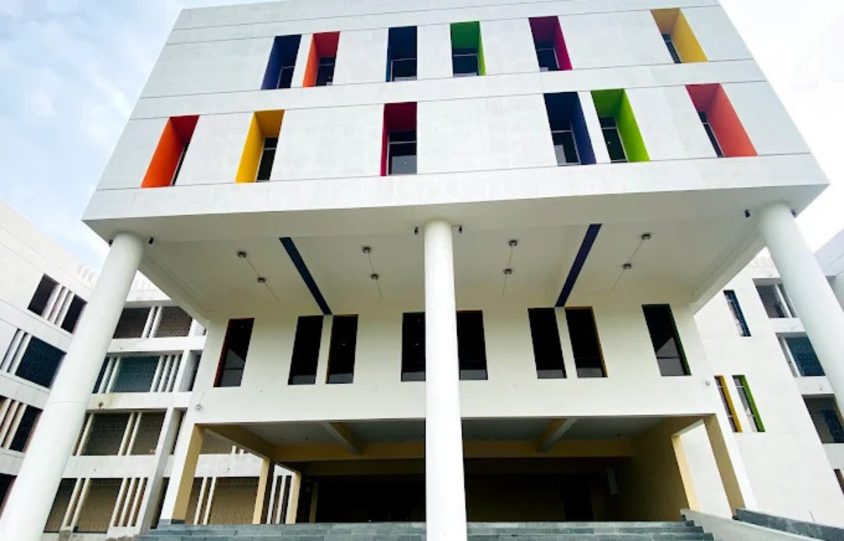
The way colour is accounted for in these factors collectively contributes to the experiential quality of the space. Earthy colours are often the most suitable for a brand that champions sustainability, and pastel colours are more appropriate for children’s brands. While being a necessary component for branding, if these colours are suitably used in the company offices or stores, they help subconsciously reinforce the brand’s messaging to the customers as well as employees. The colour also plays an important role in creating empty spaces, which puts a visual emphasis on intended elements and provides an immaculate aesthetic.
The use of colour is not limited to the paints used on the walls, but it accounts for every element used in the composition, including the colour of handles and doorknobs. The space limit thus called for two immediately important strategies, a very subdued primary colour that would reflect the plenty of light coming in through the windows - making white a no-brainer.
.jpg) The red art piece in the executive cabin is derived from the requirement of the colour as per Vastu. It takes great deliberation to weave in accent colours in spaces, as using it in the wrong way can immediately throw off the entire visual composition and make the space look disorienting. The way we used red in the project became a highlighting feature, drawing focus to the space, while also seamlessly blending in the composition.
The red art piece in the executive cabin is derived from the requirement of the colour as per Vastu. It takes great deliberation to weave in accent colours in spaces, as using it in the wrong way can immediately throw off the entire visual composition and make the space look disorienting. The way we used red in the project became a highlighting feature, drawing focus to the space, while also seamlessly blending in the composition.
Sage Green is used as an accent in the meeting space, creating a dedicated mandir space for the office, while blending into the space and evoking an earthy appeal to the overall scheme. This colour brings a necessary balance to the space, adding a layered character to the space due to its textured nature. While these colours make up the majority of the colours used, the appeal of the space finds its finesse using accent colours.
The yellow colour, combined with curved installations, enlivens the otherwise subdued space. While the design avoids darker tones that make spaces appear smaller, a tall monolith that marks the entrance to the washroom adjacent to the pantry emphasizes the height while differentiating it from other spaces. Alongside the largely white pantry, this combination evokes the association of the colours often linked to the legal profession.
We continuously employ colour as an element in our design that portrays values and principles based on a common consensus, but we also use colour as a medium to capture the unique personas each company or individual holds. It establishes something very human about all of us—we are all as much alike from each other as we are different, and colours become the most potent tool to capture and express it.
%20(1).png) Stay updated on the latest news and insights in home decor, design, architecture, and construction materials with BMR.
Stay updated on the latest news and insights in home decor, design, architecture, and construction materials with BMR.
Specification
Firm Name: Mercury Architects
Lead Designer: Ar.Santosh Satpathy, Ar.Arjun Madhavan
Photo Credits: Abhishek Sawant