Pantone Color of the Year 2024 Can Absolutely Surprise You!
- January 16, 2024
- By: Editorial Team
- INFLUENCERS
.jpg)
A unique color scheme serves as inspiration for Pantone's "Color of the Year." Every year, Pantone selects the hue that will be the biggest trend in 2024 through the Pantone Color Institute and a thorough analysis of society.
The pantone color of the year for 2024 is peach fuzz. It is described as ‘an appealing peachy hue gently nestled between pink and orange’ by Pantone. It creates a peaceful atmosphere and provides us with a place to be, feel, heal, and grow. It encourages a sense of belonging, recalibrating, and self-nurturing.
Adding Peach Fuzz to interior areas makes them feel comfortable. Whether used as an accent within a pattern or as wallcovering, upholstery, or curtains, it creates a feeling of coziness.
‘Seemingly tactile, inviting you to reach out and touch the product’ is the 2024 color of the year. This color stimulates the sense of touch, introducing you to a variety of woven patterns and vertisol textiles with virtually limitless possibilities.
The field of design breathes life into spaces with a symphony of tones. For all of our solutions, at vertisol, we provide cutting-edge color schemes that adhere to the newest developments in interior design and décor.
The color is a blushing orange-pink and is one of the company's more than 20,000 color palettes. Experts at Pantone believe that this cozy, warm hue will perfectly capture the spirit of the upcoming year. The executive director of the Pantone Color Institute, Leatrice Eiseman, characterizes Peach Fuzz as ‘warm and welcoming’ and ‘nurturing’.
"People are looking for colors that soothe, colors that are warm and soft, colors that nurture and provide us comfort in a world that can seem very harsh," says Eiseman.
What is Pantone?
The company, whose headquarters are in Carlstadt, New Jersey, is best known for developing the Pantone Matching System, a uniform color index that was initially developed as a tool for commercial printing but is now used in graphic design, fashion design, and product design. This system enables producers and artists around the globe to match and compare shades within the system. Pantone's color matching system is a resource that is used both digitally and traditionally.
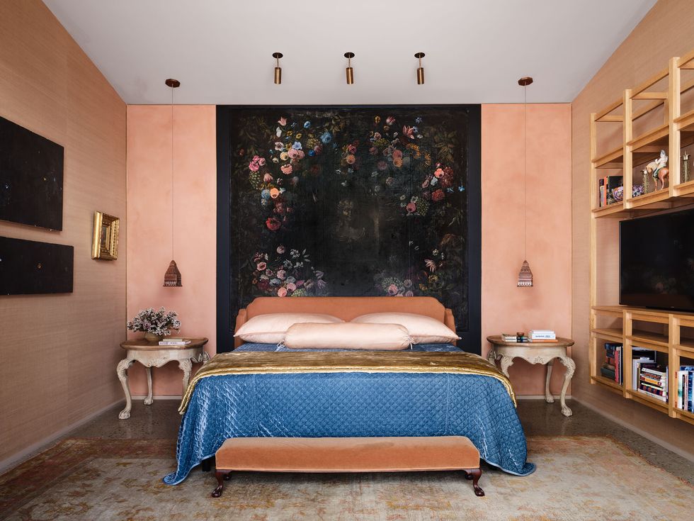
This new, muted hue is referred to as ‘Peach Fuzz 13-1023’ and characterizes as "nurturing" and ‘quietly sophisticated’. We were thrilled to find a variety of items in similarly peachy hues for your home, ranging from rugs to lamps to fruit bowls. These items are much more neutral than the previous selection and are also easier to style. However, if you want to go all out, the color also looks great on walls.
It can be difficult for designers and homeowners to incorporate new trends into their spaces in a way that feels both modern and classic. When a new color trend like "Peach Fuzz" is introduced, it can be intimidating because people are unsure of its adaptability, durability, and compatibility with other design elements. Achieving a timeless elegance in home design while embracing new trends requires a careful balance.
.jpg)
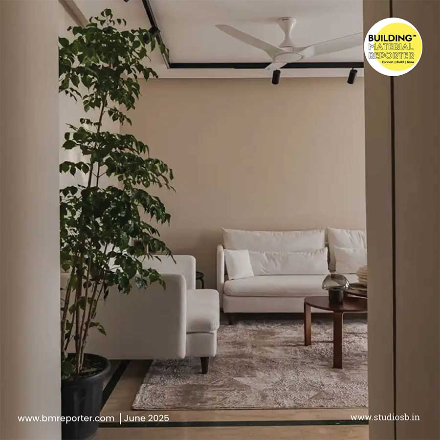
Peach Fuzz can bring coziness and relaxation to living rooms. It pairs well with neutral tones, such as whites and greys, allowing for a space that feels open and airy yet grounded. A touch of modern elegance can be added by incorporating this color into art, furniture, or cushions.
Peach Fuzz isn't just for interiors. Its adaptability also applies to a home's exterior. This color can serve as an inspiration for exterior finishes, trim, or accent pieces that distinguish a home while balancing it with its surroundings.
.jpg)
A home's exterior walls can be made to look warm and inviting by applying Peach Fuzz. It enhances the architectural design's relationship with nature and works well with natural materials like wood and stone. It's important to keep in mind that the ultimate objective is to design spaces that speak to the people who live in them as we embrace this new color trend. A weapon in the designer's toolbox, the shade allows them to create spaces that are not only visually beautiful but also intimately tailored to the requirements and goals of their clients.
Building Material Reporter believes in serving the best! Stay tuned with us for more ideas related to home decor, design, architecture and construction materials in the industry. Follow us and stay updated.